
Page Layouts begin...
sketched layout of the Athens Agora (or market) for the "Trial of Socrates".
With the script ready to go, and after characters have been good and developed, its time to start laying out the pages. This is the stage of the comic that looks like the least amount of effort has gone into it, but is actually one of the more creatively demanding parts. Its here that you must finally envision the story.
The art of panelling a script is subtle yet immensely important to the story. One might believe it to simply be all about placing the characters and action within designated panels and that's that. Technically...yes. But, that's also a great way to set yourself up, and the story, for failure. Really, the work that an artist must do for the story is akin to all the hard work that a set designer, location scout, cinematographer, camera operator, lighting technician, actor, and director must do on the set of a show or movie, and this is still at pre-production! Seriously, we do all the heavy lifting.
The first thing I do before laying out a page is read that page's script again. Then read it again. And also read the next few pages to see what any continuing action might affect how I place any characters or objects on this page. At this point I'm also looking for the key items or objects that the writer often forgot to mention ahead of time, and be sure to put it in the frames when it should first be seen. Its also the point where you need to identify how much, if any, dialogue is in each panel, and how many panels are on the page. Is it a close up shot or a wide shot? Should you do a wide panel for the close up anyways? Is it asking for a high angle wide view or not? Maybe the high angled wide shot would be better seen as a tall, narrow shot. What parts of the story should receive the most attention for the page, and how do you get all the narration and action to flow cohesively? Its this kind of advanced preparation that will save you hours of head ache and work, because invariably, you will end up doing some edits and alterations of the page anyways, so an ounce of preparation is worth a pound of cure.

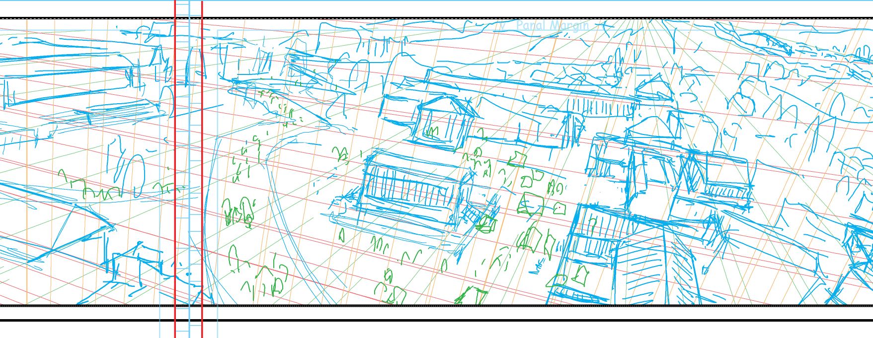
A great opportunity to set the location for the reader for the pages to come. Here, a helmet and shield need to be placed for a character to easily access 3 pages later.
In Brian Michael Bendis's invaluable book "Words for Pictures" (Watson-Guptil, 2014), He talks a lot about how to write and script for comics, but also how to build drama and action page to page. He even suggests attempting to end each page on a cliffhanger, or in such a way that you would layout the page as it's own piece of art. Its this kind of thinking and writing that makes comics so great. When I layout pages, I try to bring this approach to the writer's story. Sometimes this means combining a few panels because the action or shot is redundant or unnecessary. Sometimes panels also need to be broken up from one panel to two, even three, depending on what you think would heighten the quality of the story. Really, its up to you as an artist to bring the vision to the story.
Below you'll find a few pages from the forth coming "Trial of Socrates". A quick aside, all the artwork being done here is on Photoshop, and I put each colour on its own layer in a sketch folder in the document. I set up my document to be 11x17 inches, 300 dpi, RBG or CMYK. At this point, if you haven't set this up as a default template for comic pages, be sure to save one a blank seperate one, keeping it aside. First, after reading out the script, I block out the panels on a layer that sits above all the artwork layers. When laying out pages, I often use 3 different colours: blue, green, and red. I don't often discriminate about which colour should be what, but I tend to use green as the background, blue as the people, and red for word or caption balloons. This tends to make my loose drawings easier to identify later when I do the actual line work.
As mentioned, I keep my "pencil" sketches and layouts fairly loose. Mostly I do this for two time-saving reasons. One, because if the writer doesn't like how you've done a certain panel, its easier to change. Second, I feel that you get better action out of your characters when you sketch them out loosely, and plus, save the hard work for the line art! You and the writer should be able to get a good understanding of how the script is being presented at this stage, even if it looks like glorified stick figures.
I'll get a bit more into the theory of composing panels and story in another post, but for now, this should give you an idea of what's going on for "Trail of Socrates". Enjoy!
Page #2 layout
Page #4-5 spread
Page #9

